Overview of common performance metrics
 Instruction and application
 In Progress
Overview of common performance metrics
The metric you choose doesn’t just measure performance—it shapes it. The wrong choice can push your model to miss the mark or focus on the wrong priorities.Whether you’re building a model to classify customer feedback or predict delivery times, the performance metrics you choose directly influence how your model is judged—and how it's improved.
In this section, we’ll explore key performance metrics for two major types of machine learning problems:

Classification metrics
Classification models help sort data into categories like loan approvals, intent detection, or customer segmentation. These models are everywhere—but accuracy alone doesn’t tell the full story. You need to understand what your model gets right, what it gets wrong, and how those errors affect real-world decisions.
Let’s make this concrete with an applied example.
Business context: Airline customer feedback classification
You’ve built a machine learning model for an airline’s customer service team. Its job? Automatically classify incoming feedback into three categories:
- Complaint
- Suggestion
- Praise The system is designed to route messages to the appropriate department, reduce manual triage, and improve response time. The model reports 89% accuracy—but is that number meaningful? Let’s take a closer look.
** Multiclass confusion matrix** To evaluate how the model performs across categories, you generate a confusion matrix like the one below:** Predicted: Complaint** ** Predicted: Suggestion**** Predicted: Praise** ** Actual: Complaint** 2203010** Actual: Suggestion** 2018025** Actual: Praise** 515195** How to read the confusion matrix:**
-
Rows represent the actual labels.
-
Columns represent the predicted labels.
-
Diagonal cells (220, 180, 195) show correct predictions.
-
Off-diagonal cells show misclassifications.** From this matrix, you can identify:**
-
Strong performance on “praise” classification.
-
Some confusion between “complaints” and “suggestions,” which could delay issue resolution.
-
Low but non-negligible misclassification of “complaints” as “praise”—a risky error in terms of customer satisfaction.** Precision, recall, and F1-score** To get a more nuanced view of your model’s classification performance, especially in imbalanced or multi-class scenarios, evaluate performance** per class** using values from the confusion matrix.
Let’s walk through the metrics for the ‘complaint’ class using the matrix from the airline customer feedback example above.
Precision
- ** Formula**: TP / (TP + FP)
- From the matrix:** True Positives (TP)**= 220
- ** False Positives (FP)**= 25 (predictions of complaint that were actually other classes)
- ** Calculation**: Precision = 220 / (220 + 25) =** 0.898**
- Precision tells you: Of all messages predicted as complaints, how many were actually complaints? This helps minimize false alarms to the service team.
Recall
- ** Formula**: TP / (TP + FN)
- From the matrix:** False Negatives (FN)**= 40 (actual complaints predicted as something else)
- ** Calculation**: Recall = 220 / (220 + 40) =** 0.846**
- Recall answers: Of all actual complaints, how many did the model identify? This ensures critical issues aren’t missed.
F1-score
-
** Formula**: 2 × (Precision × Recall) / (Precision + Recall)
-
** Calculation**: F1 = 2 × (0.898 × 0.846) / (0.898 + 0.846) =** 0.871**
-
F1-score provides a balanced view when both false positives and false negatives matter.** Summarizing multiclass performance: Micro and macro averages** Once you’ve calculated precision, recall, and F1-score for each class, you may want to summarize the model’s performance in a single metric—especially when presenting to stakeholders. That’s where micro and macro averaging come in.** Micro average** Aggregates the total true positives, false positives, and false negatives across all classes before calculating the metric.
-
** Best when** overall volume matters more than performance on any individual class.
-
** For example,** if the airline handles thousands of “praise” messages and only dozens of “complaints,” micro average will reflect this imbalance in favour of the majority class.** Macro average** Calculates the metric for each class individually, then takes the average.
-
** Best when** each class matters equally—even if some are rare.
-
** In our case,** complaints may be rare, but they’re high priority. Macro averaging ensures performance on this class isn’t overshadowed by the more common ones.
Practice activity: Calculating performance metrics
** Scenario** You're evaluating a machine learning model that classifies ** emergency calls** into three categories:
-
** Fire**
-
** Medical**
-
** Other** You receive the following confusion matrix after running the model on a test dataset:** Predicted: Fire** ** Predicted: Medical**** Predicted: Other** ** Actual: Fire** 9082** Actual: Medical** 68014** Actual: Other** 51085** Calculate the following metrics for the 'Fire' class:**
-
Precision
-
Recall
-
F1-score
Use caution with accuracy
In this case, 89% accuracy might sound impressive—until you realise most messages are ** praise** . If praise dominates the dataset, the model could predict “praise” every time and still appear to perform well.** Lesson:** Accuracy can be misleading in imbalanced datasets. Always interpret it alongside more targeted metrics like precision or recall.
Regression metrics
You’ve worked with regression models before—you know they predict continuous values like cost, duration, or demand. You’ve likely used metrics like MAE, RMSE, and R² to evaluate them.
But in practice, choosing the ** right** metric isn’t just about model performance—it’s about** making the right trade-offs** for the business context.
Is a 10-minute error acceptable? Are large mistakes worse than frequent small ones? Will stakeholders understand what your metric is telling them?
To make those decisions more concrete, let’s ground them in a real-world scenario.
Business context: Predicting food delivery times
You’re working with a food delivery platform that wants to provide more accurate ETAs to customers. The model uses order size, time of day, weather, and location to predict how long each delivery will take.
You’ve built and tested a model—but stakeholders need answers to practical questions:
- How far off are we, on average?
- Are big mistakes frequent?
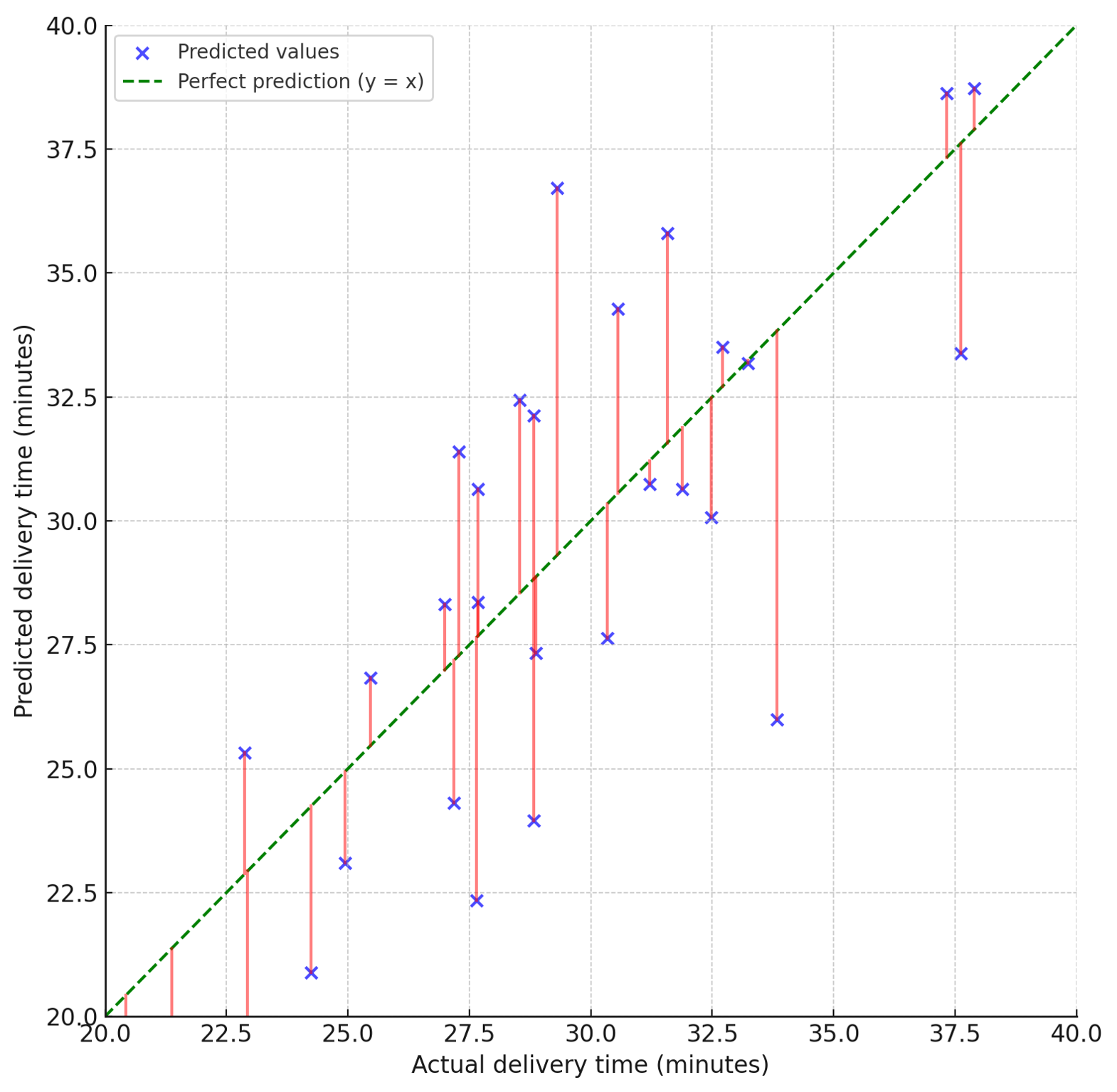
- Can we explain the model’s usefulness to leadership? The diagram below helps bring these questions to life. Each dot shows a single prediction compared to the actual delivery time. The green dashed line represents a perfect prediction. The red lines highlight the size of the error—showing how far off each prediction was.
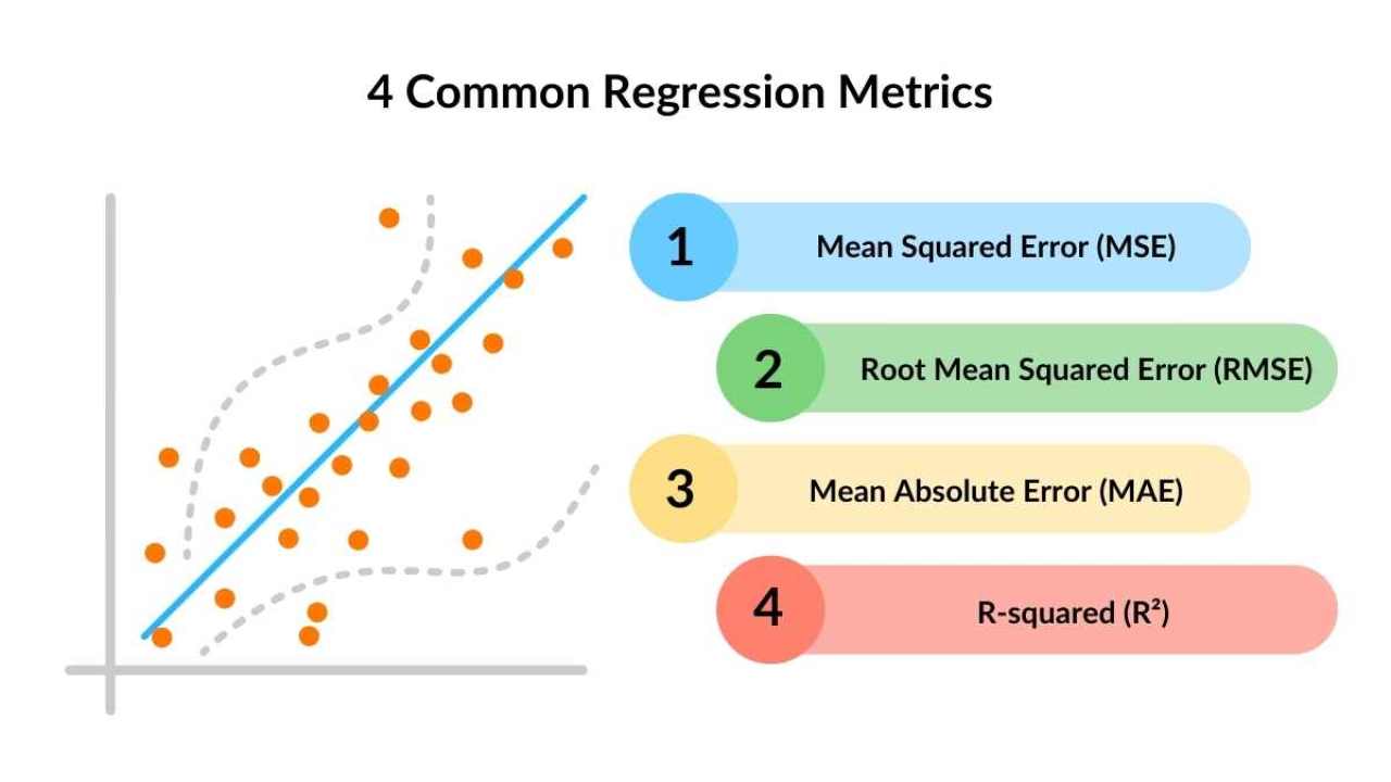
Let’s walk through the most common regression metrics—and how to choose the right one for the job.
 ** Mean Absolute Error (MAE)**
** What it tells you:** On average, how far off are your model’s predictions, regardless of direction?** How it works:** It takes the absolute value of each error and finds the average. If your model predicts a delivery time of 28 minutes but the real time was 32, that’s a 4-minute error. MAE just looks at the size of that error—not whether it’s over or under.** Why use it:**
- It’s ** easy to interpret**—the result is in the same units as your target variable.
- It treats all errors equally—so it’s good when ** every mistake has similar cost** .** Example:** If your model has an MAE of 5, you can say: “On average, our delivery time predictions are off by 5 minutes.”** Mean Squared Error (MSE)**
** What it tells you:** How large are the ** squared errors** , on average?** How it works:** Each error is squared before averaging. This means ** larger mistakes count much more** than smaller ones.** Why use it:**
- It penalizes ** big errors** more heavily.
- It's commonly used in ** training models** as an optimization target.** But:** Because it squares the error, the result is in squared units—making it less intuitive for reporting.** Example:** An MSE of 64 means your average squared error is 64, but that’s harder to explain than MAE unless you take the square root (see RMSE below).** Root Mean Squared Error (RMSE)**
** What it tells you:** The square root of MSE—so your result is back in original units (like minutes).** How it works:** It still penalizes large errors (like MSE), but gives you a ** more interpretable value** .** Why use it:**
- Ideal when you want to show stakeholders a ** real-world number**(e.g. minutes off), while still being sensitive to bigger mistakes.
- It’s often the best blend of ** technical and business communication** .** Example:** An RMSE of 8.2 means, on average, your predictions are off by about 8 minutes—with larger errors counting more.** R² (Coefficient of determination)** ** What it tells you:** How much of the variation in the actual values your model can explain.** How it works:** Compares the model’s performance to a simple baseline that always predicts the average. If your model performs better than that, R² will be between 0 and 1. If it performs worse, R² can even be negative.** Why use it:**
- Shows how ** informative** your model is.
- Helps ** justify its business value** .
- Useful when comparing multiple models or explaining performance to leaders.** Example:** An R² of 0.85 means your model explains 85% of the variability in delivery times. That’s a strong signal your features are capturing meaningful patterns.** Choosing the right regression metric: What fits your business need?**
Use the table below to compare regression metrics by ** when they matter** most:** Metric** ** Use it when…**** Ideal for…** ** MAE** You need a clear, average error in original units.Planning, stakeholder communication.** MSE** Large mistakes carry high cost.Model tuning, risk-sensitive use cases.** RMSE** You want interpretability with error sensitivity.Service delivery, SLA management.** R²** You need to show how much your model explains.Model comparison, business impact reports.## Key points
- ** RMSE** helps highlight delivery delays that could hurt customer experience.
- ** MAE** is great for explaining average performance to non-technical teams.
- ** R²** is useful when showing how effective your model is compared to guessing.
