Error analysis - Seeing beyond the score
 Instruction and application
 In Progress
Error analysis - Seeing beyond the score
** Your model reports 91% accuracy. Sounds great, right?**
But what if that means it misses most fraud cases or flags too many healthy patients for extra screening?**
In the previous section, you learned how cross-validation helps you estimate a model’s overall performance. Now it’s time to go deeper—to understand why your model performs the way it does and where it’s making the wrong calls.

Understanding errors with confusion matrices
You encountered confusion matrices in earlier modules as a way to calculate metrics. Here, we revisit them through a new lens: to diagnose failure patterns that affect model usability, risk, and stakeholder trust.
A confusion matrix shows you the distribution of predictions:** Predicted: Positive** ** Predicted: Negative**** Actual: Positive** True Positive (TP)False Negative (FN)** Actual: Negative** False Positive (FP)True Negative (TN)This breakdown helps you calculate:
- Precision = TP / (TP + FP)
- Recall = TP / (TP + FN)
- Specificity, F1-score, and other key diagnostics
Example: Manufacturing quality control
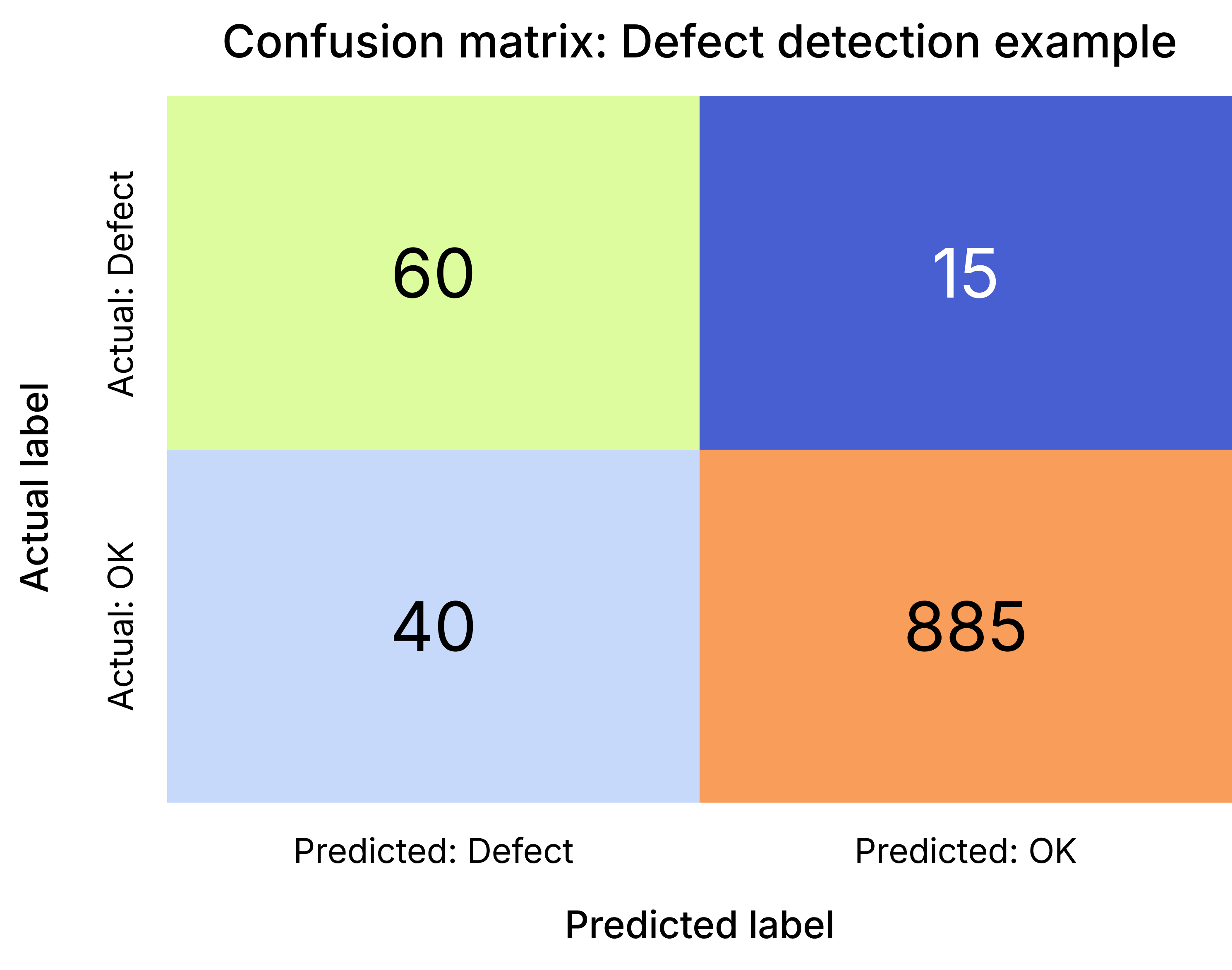
You’re training a model to detect faulty items on a production line. It predicts 100 items as defective—only 60 actually are.
The confusion matrix below shows how those predictions break down:
-
True Positives (TP) = 60
-
False Negatives (FN) = 15
-
False Positives (FP) = 40
-
True Negatives (TN) = 885 From this, you calculate:
-
Precision = 60 / (60 + 40) = 0.6 → 40% of flagged items were false alarms.
-
Recall = 60 / (60 + 15) = 0.8 → 80% of actual faults were caught.
Practice exercise
A quality control model was tested on 1,000 items. The results are:
- 55 items were correctly predicted as defective.
- 20 defective items were missed.
- 35 items were incorrectly flagged as defective.
- The rest were correctly identified as non-defective.
- Construct the confusion matrix.
- Calculate ** Precision** and** Recall** .** Takeaway:**
You may need to reduce false positives to avoid overloading your QA team—or accept them if catching real defects is more critical. Confusion matrices help surface these trade-offs clearly.
ROC curves: Visualising trade-offs at different thresholds
The ** ROC curve** lets you evaluate your model's ability to distinguish between classes** across all possible classification thresholds** .
It plots:
- ** True Positive Rate (Recall)** vs.
- ** False Positive Rate (FP / (FP + TN))** The ** Area Under the Curve (AUC)** tells you how well the model separates positives from negatives. An AUC close to 1 is excellent. An AUC of 0.5 suggests guessing.
Example: Cancer risk prediction
You’re building a model to flag patients who may be at risk for a rare but serious form of cancer. Your model outputs a ** probability score** for each patient, but you still need to decide the threshold above which you classify someone as “high risk.”
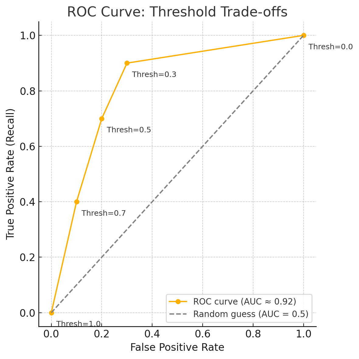
At a default threshold of ** 0.5** , the model achieves:
-
** 70% recall**— it catches 7 out of 10 true positive cases.
-
** Low false positive rate**— only a few healthy patients are incorrectly flagged. However, when you ** lower the threshold to 0.3** , something important happens:
-
** Recall increases to 95%— almost every true positive case is caught. But the ** false positive rate increases sharply— now many more healthy patients are flagged for follow-up.
Interpreting the ROC curve
The ** ROC curve below** visualises how your model performs across thresholds:
- Each ** point** on the curve represents a threshold.
- Moving ** up and to the right** means you’re increasing recall, but also the false positive rate.
- The ** ideal point** is close to the** top-left corner**(high recall, low FPR).
- The ** diagonal gray line** represents a model that’s guessing randomly (AUC = 0.5).
- Your model’s ** AUC ≈ 0.92** , which means it’s generally good at distinguishing between at-risk and not-at-risk patients.
Key point
As you move along the ROC curve—adjusting the classification threshold—you’ll typically ** increase true positives at the cost of more false positives** . The** ideal balance depends entirely on context** .
In healthcare, for example,** missing a true case** could mean delayed treatment, which may be far worse than** flagging a healthy patient** for further testing.
Action item: Reflect - What’s the cost of getting it wrong?
Take a moment to think about a real or hypothetical ML project in your field—whether it’s fraud detection, hiring, healthcare, logistics, or something else.
Then consider the following questions.